From a Single Sample to the Complete Interior
Oak introduces natural texture into an interior. Its appearance depends on more than the colour of the wood: grain, surface finish and neighbouring materials all contribute to the overall impression.
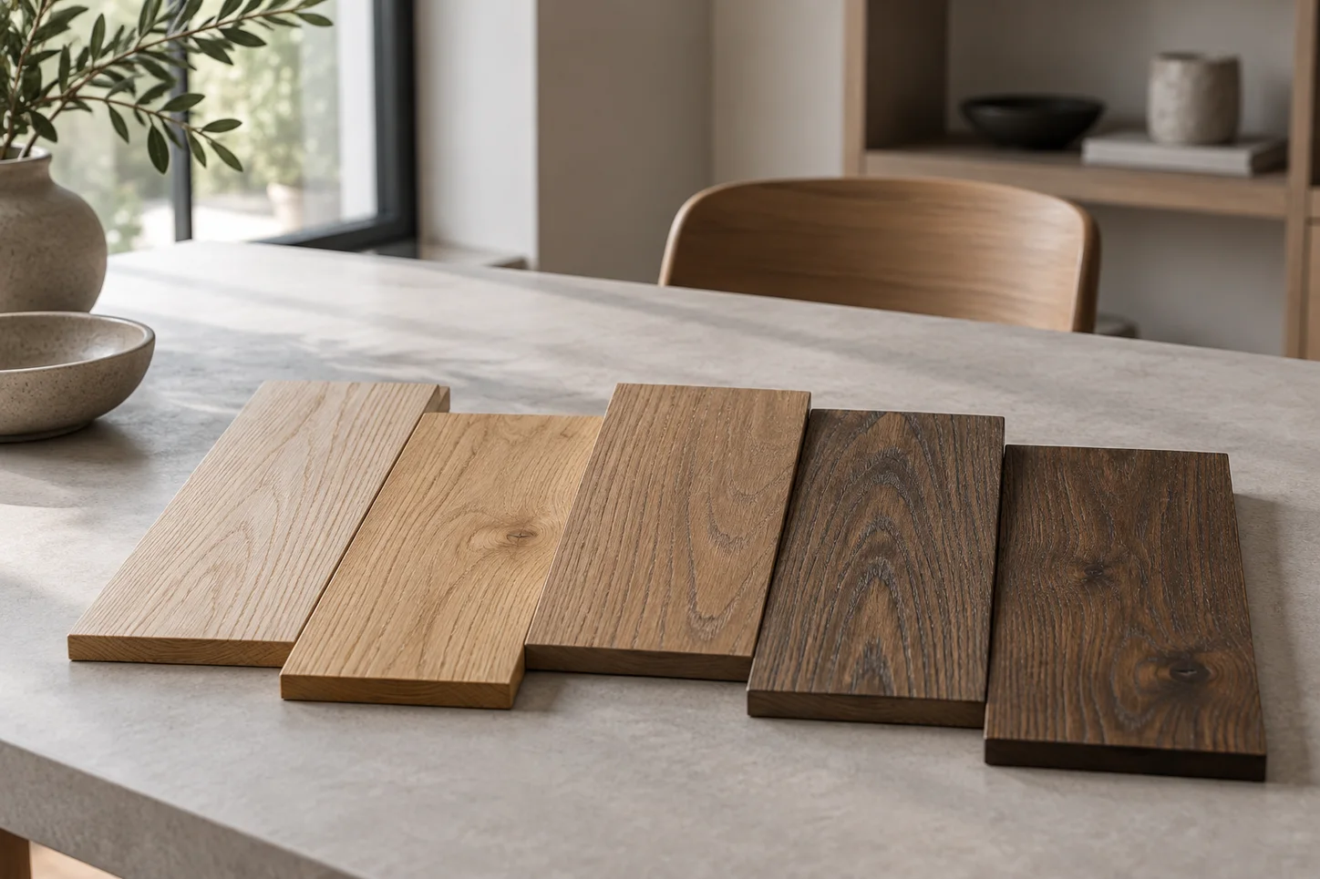
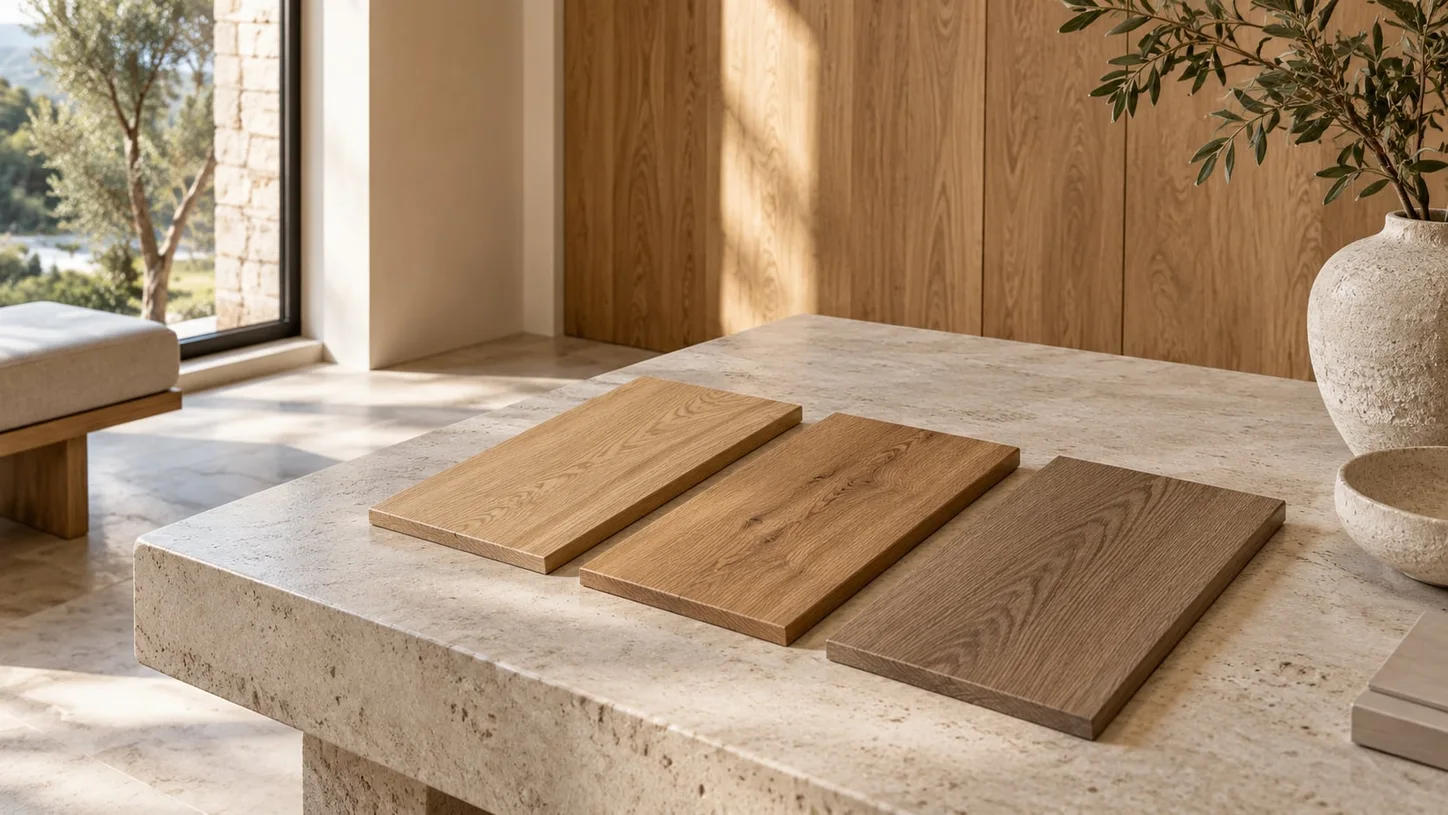
A sample on a desk therefore offers only a first indication. A more useful comparison places the wood beside the intended wall colours, fabrics and stone surfaces.
Light Changes the Impression
The same surface can look different beside a window and further inside a room. Artificial lighting also changes how colour and texture are perceived.
When selecting materials, it helps to view the samples in several positions and at different times of day. This gives a clearer sense of how the wood may appear in its intended setting.
What to Look for When Comparing Samples
Place the samples side by side under the same lighting.
View the wood together with the other proposed materials.
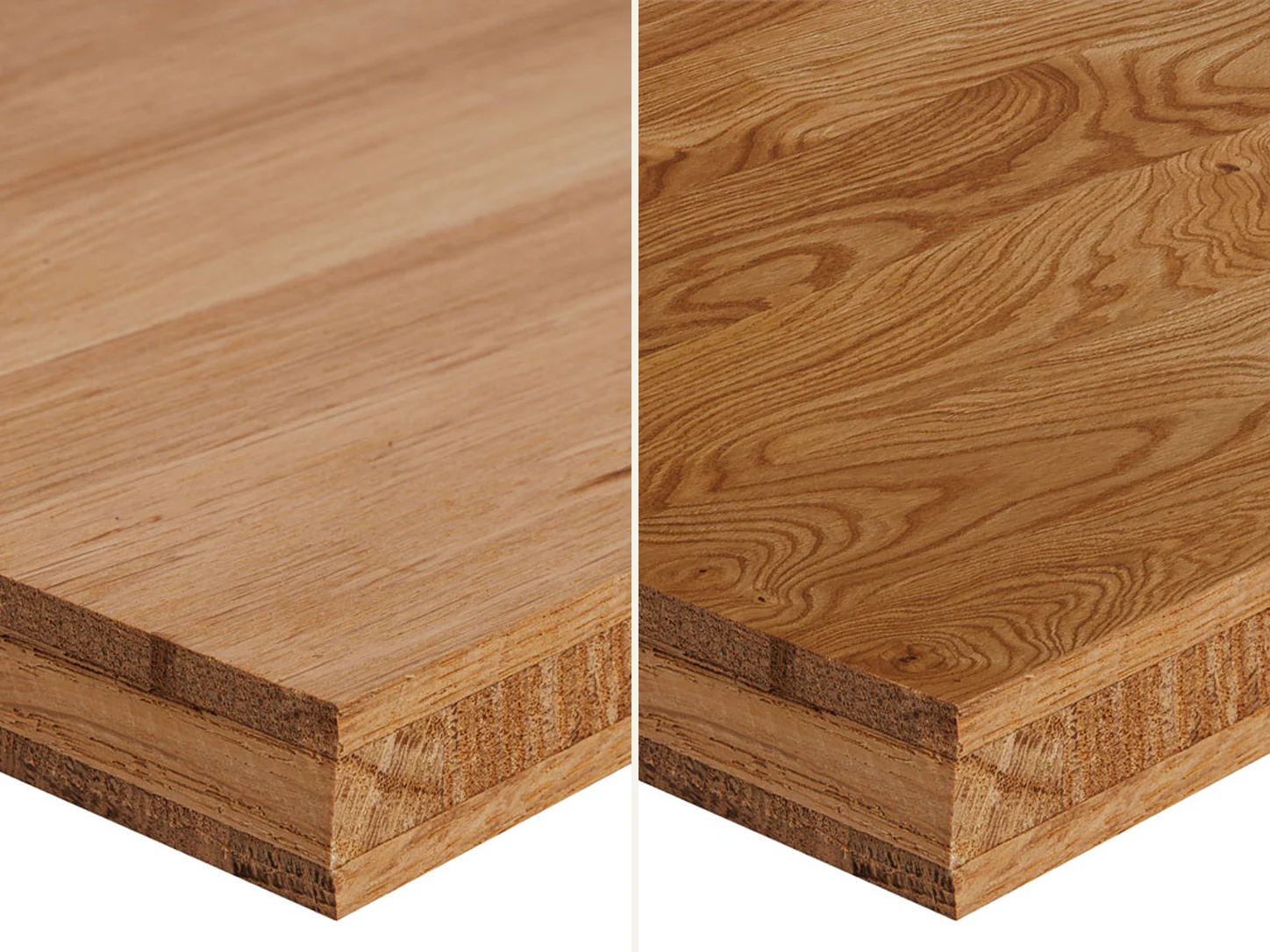
Consider grain, colour variation and the appearance of the finish.
For larger surfaces, also consider the direction of the grain.
A coherent material palette comes from the relationship between surfaces. Samples make those relationships visible and provide a shared basis for discussion between designers and the people carrying out the project.
← All articles